Tailwind doesn't need you to write CSS, so you have to write the displaying way inside the “class” in the HTML.
<p class="text-blue-500">Welcome to DevsForDevs</p>As you can see, Tailwind obey something : [element-status-value]. You don't need to follow this completed one if you don't need all.
Now we talk about the container. It's a very important thing in CSS.
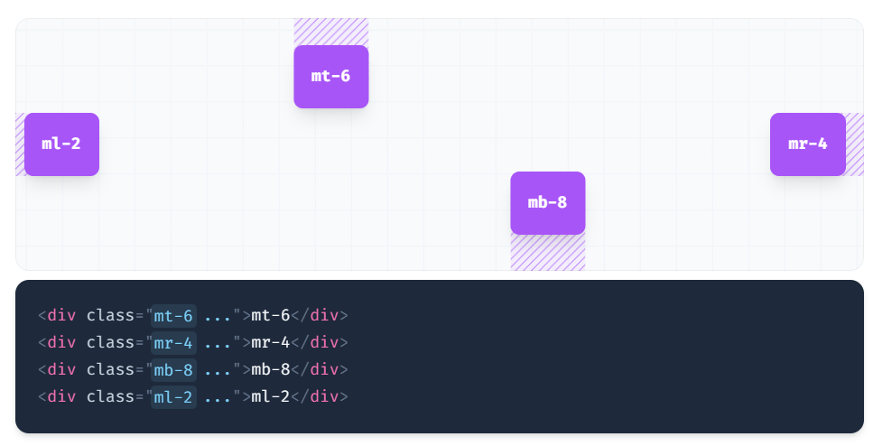
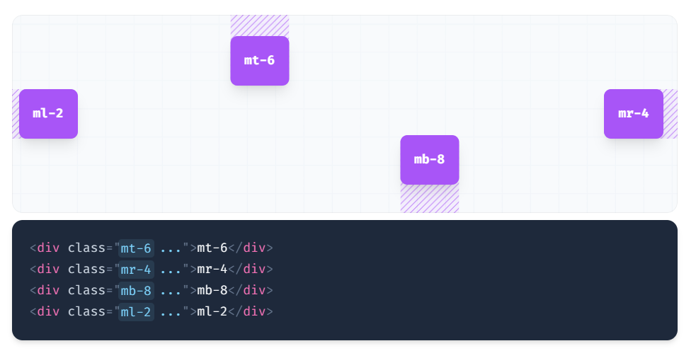
1. Padding and Margin
Tailwind want to make the code simple, they simplified these words:Padding → p ; Margin→ m; left→l; right→r; top→t, bottom→b. It's easy to remember. Using p and m with l, r, t can control the container size and position.
Apart from this, tailwind also provide us x and y, x can control both left and right, y can both control top and bottom.
There are some designed style code. You could refer “Padding — Tailwind CSS" or "Margin - Tailwind CSS".
Margin:
Padding:

2. Width and Height
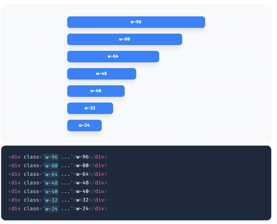
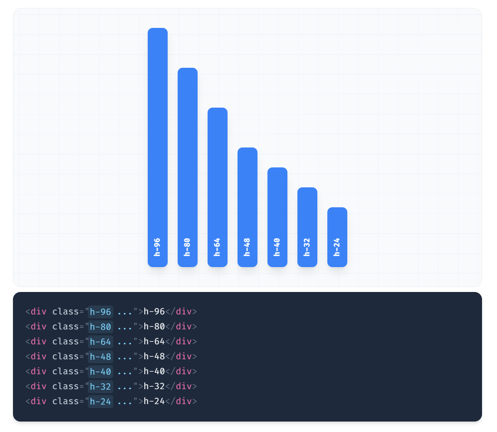
Width and Height are the key CSS words to control the container in the size. They are usually simplified as w and h. The usual format is w-value and h-value. There are also some designed CSS code in the Height - Tailwind CSS and Width - Tailwind CSS. you can refer those page too.
Width:
Height:
There are also the min-width/max-width, min-height/max-height. According to the name, you could guess it control the minimum / maximum value of the container.
The format is min/max-h/w-value.
About the value, there are many displaying way as same as CSS. Use w/h-screen to make an element span the entire width/height of the viewport. The w/h-auto utility can be useful if you need to remove an element’s assigned width/height under a specific condition.
Refer:
